After completing a website audit there can often be a lot of work to get busy with. Tags need to be added, URLs need to be adapted, internal and external links may need addressing, and those meta-descriptions won’t write themselves.
But often a website audit will also conclude that there are non-technical areas of the site that need addressing in order to reach visitors and convert those visitors into customers.
And among the most common areas to address? Website design.
The design of a website is essential in helping a visitor determine what your unique selling point is, helping them navigate your offer, and improving the experience that they have while on your site. The right choice of colors, the correct photo and image options, the effective use of icons, and the size, shape, and font of the text used can all influence the experience of a visitor on a website.
It’s no surprise, then, that a website redesign is something that even the biggest brands and businesses online will sometimes consider. What’s more, when these brands and businesses make the choice to undertake a website redesign, their efforts serve as case studies for others with regards to what works, what doesn’t, and how to move from down in the dumps to to up on top.
In this post we look at the website redesigns that have been undertaken by three businesses, and identify what can be learnt by other businesses from these efforts.
Evernote
It’s no secret that we’re big fans of Evernote at DOZ. It’s an essential part of our content creation process and helps the team here to blog better, too. While we’re confirmed Evernote users, for those unfamiliar with the power in this tool the first stop for more information is likely to be the Evernote website – and it’s a site that has undergone some serious changes over the last few years.
Crayon has done a great job at tracking the various iterations of the Evernote website over time, and comparing some of the most recent screenshots demonstrates how the Evernote website redesign has progressed.
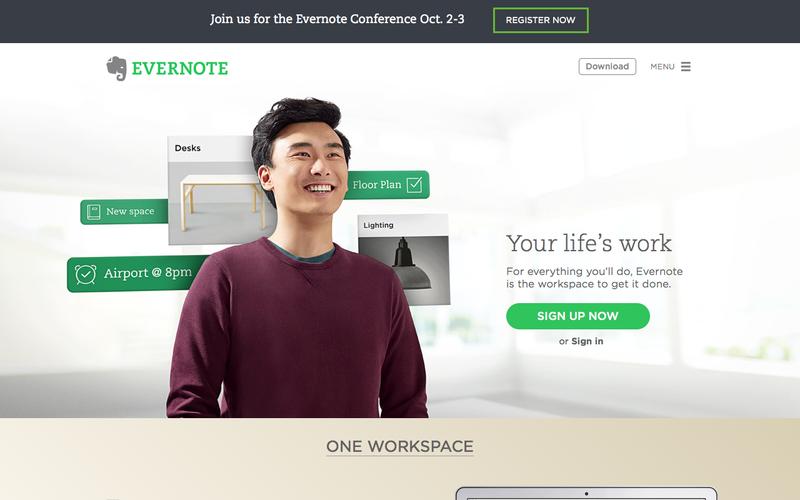
Back in 2014 the Evernote website looked like this:
By December 2015, however, the website looked like this:
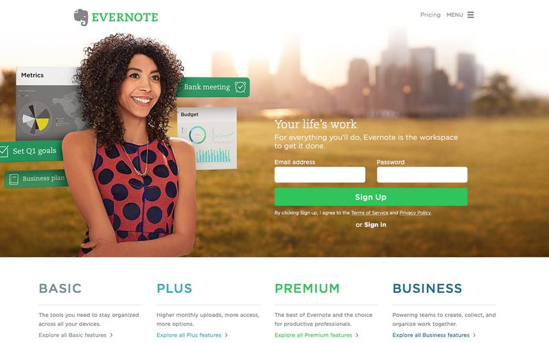
Some things have remained the same, of course. There’s still a smiling individual looking out to the call to action, though the gender of the individual has changed. There’s still a few Evernote elements floating behind the individual, too, suggesting that the app is helping keep everything organized in the background – precisely the point of the software, of course.
But note the differences, too.
The call to action is different: instead of clicking on ‘Sign Up Now’ and proceeding to a new screen to enter basic data the new version offers the space to fill in that basic data and sign up on the front page. Cutting out the steps and cutting down on the clicks to sign up is a good thing for Evernote.
Note, too, the bottom of the screen where the 2014 version talks about the app (One Workspace) while the 2015 version is talking levels of service and pricing (Basic, Plus, Premium, and Business).
The buttons, too, are different. While the ‘hamburger’ style menu has been retained at the top right, the ‘Download’ option has been replaced with a ‘Pricing’ button. This makes it easier for the visitor to the Evernote site to find the information they need: if they want the download, they’ll sign up – but first they need the pricing data.
The new version is brighter, has less white space, and a bigger sign up button. Seriously: can you miss the sign up button now?
Evernote has made a serious effort at cutting down the time between a visitor arriving on the site and that user signing up. They’ve offered better and more relevant information to the user ‘above the fold’, and they’ve made better color choices to brighten the screen for their visitors.
The verdict? Evernote made some simple but serious improvements.
Jawbone
Wearable technology is becoming a bigger part of the daily life of many. Whether smart watches or fitness trackers, as simple as a pedometer or as complex (and obtrusive) as Google Glass, wearables are all the rage. One of the leaders in this new domain is Jawbone, a fitness tracker and wearable company competing with names like Fit Bit, Garmin, and Apple for your wearable dollars.
While Jawbone wearables are available in stores and via online retailers like Amazon, for a potential customer the Jawbone website is likely to be a must-visit site before a purchase is made. After all, with so many competing products and new features emerging every few months, the website of the company behind the product is likely the best place to turn for the latest and most accurate information.
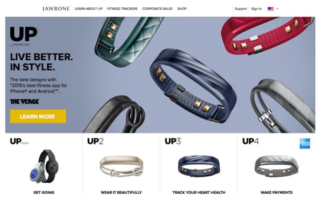
Here’s how the Jawbone line was previously presented to inquisitive internet users, again via Crayon:
And here is the new, updated Jawbone website:
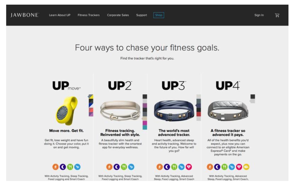 The changes introduced by this website redesign are more than cosmetic.
Start at the top: note how the header bar has changed from clear to black? This makes it easier for the user to identify the menu items. What’s more, it also allows Jawbone to effectively highlight the place where they want the visitor to click – Shop – rather than just have this this as another option in a line of standard menu items as in the previous version of the site.
The website redesign also brought the different Jawbone products front and center. No longer is the prime real estate at the top of the page devoted to a jumble of Jawbones and a review from a website. Now the four different Jawbones are presented side by side, and the copy under each tells the specific story of that device.
Talking of copy, see how it has evolved with the redesign. In the earlier version it is two, three or four words that speak to a single feature of the product but suggest nothing much more than that. In the new version, the copy – while still not overwhelming – provides the reader with far more information about the product they are considering.
Compare, for example, the copy for the UP3 device:
- Old Version: Track Your Heart Health.
- New Version: The world’s most advanced tracker. Heart health, advanced sleep and activity tracking. Welcome to the future of you. How far will you go?
It’s not only more inviting, but it clearly explains additional features of the device that the four-word long title in the older version of the site cannot.
Finally, it is worthwhile considering the icons used by Jawbone to demonstrate features and imply the value of the devices on offer. For the entry-level device on the left of the screen (UPmove) there are four colorful icons that communicate the features of the device. Moving across the screen and up in price point, these icons increase in number and communicate additional features and value to the user.
Jawbone may still sell many of their products in online and offline stores, but the pricing and value proposition on their website will make it easier to convince visitors to consider their products, and even make their purchase directly from the Jawbone website.
99 Designs
When you want a logo, a book cover, a poster, or just about anything else designed for a reasonable price by a professional designer, where do you turn? For more and more businesses the answer to that question is 99 Designs.
The graphic design marketplace includes hundreds of thousands of professional designers who compete to win the design contests that are central to the 99 Designs site. With thousands of satisfied clients, 99 Designs has established itself as a leader among online marketplaces and a well-known name in the field of content creation and graphic design.
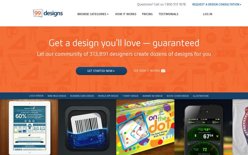
Like Evernote and Jawbone, 99 Designs have also worked through their own website redesign, and Crayon again offers screenshots of the transition between 2014 and mid-2015. Here is the earlier front page:
And here is the July 2015 website redesign:
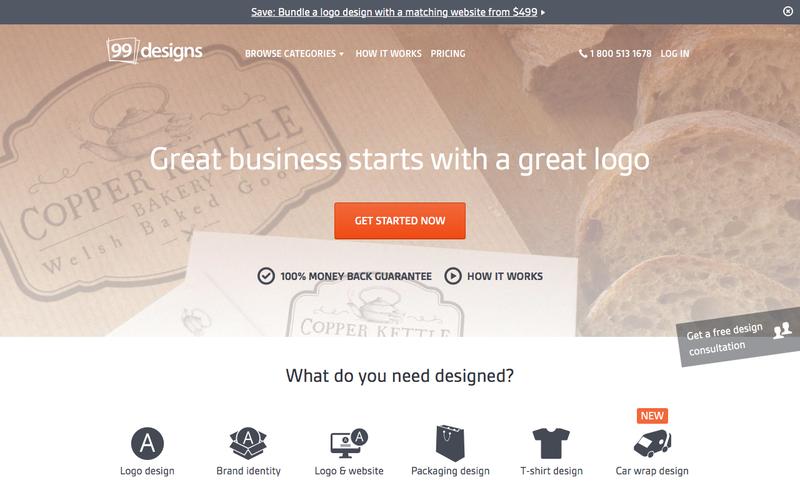
The differences are stark and significant.
The first and most apparent difference relates to color. In the earlier version of the website it was bright orange, incredibly loud, and the example works provided even more bright and contracting colors near the fold. While this garners the attention of the visitor, it doesn’t do much for the user experience. The examples, too, give an idea of what 99 Designs offers, but the clash of colors makes the site look to heavy.
The more recent version is far easier on the eye. The orange has been retained as part of the overall branding of 99 Designs, but it is filtered throughout and the only bright orange retained is on the call to action button. Instead of examples from the 99 Designs marketplace being used to demonstrate what is possible, the site offers icons with captions as an alternative.
Another major change is the offer that is front and center on the site. In the earlier version there was a ‘Get Started Now’ button but no indication as to where ‘getting started’ would take the user. In the more recent iteration 99 Designs has led with their least expensive and most obvious gateway product, the logo. As a low-cost way into the 99 Designs universe, it’s an effective hook for new customers who want to test the guaranteed service that the company offers.
Talking of guarantees, note the difference in copywriting between the two designs. In the 2014 version the word guarantee forms part of the copy but is undefined. It appears and feels like sales patter and not a serious corporate undertaking. In the 2015 version, however, the guarantee is less prominent but offers more information. It’s a ‘money back’ guarantee, and this suggests something a little more serious that just what a salesperson might allude to in a pitch.
As a design marketplace, 99 Designs lives and dies by their graphic design and, in pursuing this website redesign, they’ve made improvements over their previous offer. The new site is flatter, cleaner, and helps the user get started by pushing them towards a gateway product instead of a more general ‘go’ button. It’s a step forward and a great website redesign.
Conclusion
When your website audit includes a recommendation to undertake a website redesign it can seem daunting and knowing where to start can be tough. Additionally, when a lot of time, effort, and money has been invested in a business site, any recommendation to undertake a website redesign might initially seem like an overreaction to low traffic or low conversions.
However, as the examples of Evernote, Jawbone, and 99 Designs demonstrate, strategic website redesigns can help make sites easier to use, more attractive to users, and funnel visitors more effectively towards buying decisions. It’s more than a simple refresh, it’s a way for a business to move forward and help to reach the digital marketing targets that they have set for themselves.
Seen a great website redesign? Let us know what impressed you on Twitter!


48 Comments
675397 742763Taylor Lautner By the way you may want to take a look at this cool site I found 533381
In my relentless pursuit of peak performance, I unveiled the next level by buying testosterone online. Fueled by the desire to elevate my physical capabilities, I embarked on an extensive research https://misterolympia.shop/buy/injectable-steroids/testosterone/testosterone-cypionate/ journey and connected with trustworthy sources. This transformative experience opened doors to new possibilities, empowering me to reach greater heights in my fitness pursuits.
With a wide selection of anabolic steroids available for sale online, we take pride in offering only the highest-quality products. We carefully curate our inventory, working with trusted brands known for their commitment to excellence. From premium protein powders to performance and muscle-enhancing pre-workout formulas, we have everything you need to fuel your workouts and optimize your results. Explore here: bulking.store/
541778 916130 Its hard to find knowledgeable people on this subject, but you sound like you know what youre talking about! Thanks 907715
684625 841006Maintain up the great piece of function, I read few posts on this internet website and I think that your internet weblog is actually interesting and contains lots of superb data. 596042
430144 234886Dead written subject matter, Truly enjoyed reading through . 296985
Hello doz.com webmaster, Thanks for the well-researched and well-written post!
Hello! If you are looking for a reliable place to buy Anavar, I recommend you visit https://a-steroidshop.ws/. At this resource, you can find information about the Anavar options available and orders from trusted suppliers. This site provides high-quality products to meet your needs and help you achieve your workout goals. Please refer to this resource for more information and the opportunity to purchase Anavar that meets your needs and quality standards.
569450 944616Its incredible what supplementing can do for your body and your weight lifting goals! 696979
Hi doz.com webmaster, Great content!
Sutter Health
It’s remarkable in support of me to have a web site, which is beneficial in support of my know-how.
thanks admin
My brother recommended I might like this blog. He was entirely right.
This submit truly made my day. You can not believe simply
how much time I had spent for this info! Thank you!
Dear doz.com admin, Your posts are always on topic and relevant.
258330 432730Yeah bookmaking this wasnt a bad decision fantastic post! . 61375
To the doz.com administrator, Keep up the good work!
Way cool! Some very valid points! I appreciate you writing this write-up and the rest of the site
is really good.
Hi doz.com owner, Thanks for the valuable information!
Thanks for finally talking about >Why Your Business Should Consider a Website Redesign |
DOZ <Liked it!
I blog frequently and I really thank you for your content.
The article has truly peaked my interest. I’m going to book mark your blog
and keep checking for new information about once per week.
I opted in for your Feed too.
What’s up everyone, it’s my first pay a quick visit at this web site, and post is truly fruitful in favor of
me, keep up posting these types of articles or reviews.
I like the helpful information you supply on your articles.
I will bookmark your weblog and check again here regularly.
I am rather sure I will be told many new stuff proper
right here! Best of luck for the following!
Informative article, exactly what I wanted to find.
Hi there colleagues, its great paragraph concerning teachingand completely explained, keep it up all the time.
Excellent, what a webpage it is! This website gives helpful data to
us, keep it up.
Hello! Do you know if they make any plugins to help with SEO?
I’m trying to get my blog to rank for some
targeted keywords but I’m not seeing very good gains.
If you know of any please share. Thank you!
You’ve made some good points there. I looked on the web to learn more about the
issue and found most people will go along with your
views on this web site.
Wonderful beat ! I wish to apprentice while you amend your web
site, how could i subscribe for a blog site? The account aided me a acceptable
deal. I had been tiny bit acquainted of this your broadcast offered bright clear concept
It’s in fact very difficult in this full of activity life
to listen news on TV, thus I simply use web for that purpose, and get the most up-to-date news.
After looking into a few of the blog posts on your website, I seriously like your technique of blogging.
I saved as a favorite it to my bookmark site list and will be checking back
in the near future. Take a look at my website as
well and tell me how you feel.
Great post. I was checking continuously this blog
and I am impressed! Extremely useful info specifically the last part 🙂 I care
for such information a lot. I was looking for this certain info for a
long time. Thank you and good luck.
It’s remarkable to pay a quick visit this site and reading
the views of all colleagues regarding this paragraph, while
I am also eager of getting familiarity.
I am not sure where you are getting your information, but great
topic. I needs to spend some time learning much more or understanding more.
Thanks for wonderful information I was looking for this info for my mission.
Its like you read my mind! You seem to know so much about
this, such as you wrote the ebook in it or something.
I feel that you simply could do with a few percent to drive the message home a little bit, but instead of
that, that is magnificent blog. A fantastic read. I will certainly be back.
It’s really a great and helpful piece of info. I’m satisfied that you shared this useful information with us.
Please stay us informed like this. Thank you for sharing.
It’s the best time to make a few plans for the longer term and it is time to be
happy. I have read this publish and if I could I wish to counsel you some interesting issues
or tips. Perhaps you can write subsequent articles relating to this article.
I desire to learn more issues approximately it!
meditation music
To the doz.com owner, You always provide useful links and resources.
It’s nice to see the best quality content from such sites.
We always follow your beautiful content I look forward to the continuation.
A number of them are rife with spelling problems and I find it very bothersome to tell the truth on the other hand I will surely come again again.
I appreciate you sharing this blog post. Thanks Again. Cool.
Since the admin of this web page is working, no hesitation very rapidly it will be well-known, due to its feature contents.
fantastic publish, very informative. I ponder why the opposite specialists of this
sector don’t notice this. You should continue your writing.
I am confident, you have a huge readers’ base already!
Dear doz.com webmaster, Thanks for the well-organized post!
Hello doz.com administrator, Your posts are always well-written and engaging.
Dear doz.com owner, Great post!
631337 337567I observe there is a lot of spam on this weblog. Do you need to have assist cleaning them up? I may possibly help among classes! 128736