


A few weeks back we explored Mobilegeddon and explained why it is that your website needed to be mobile-friendly.
In short, there are two good reasons: to avoid ranking penalties from search engines, and to improve the customer experience for mobile users.
In that post we outlined the three options that website owners had for avoiding penalties:
- Responsive web design
- Dynamic serving
- Separate URLs
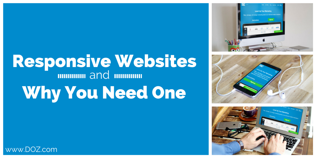
All three are options for getting ‘mobile friendly’ but there are real advantages to choosing responsive web design over the other two. In this post we’ll explain what responsive design is, offer some examples of responsive design, and explain why this option is your best option for attracting and keeping mobile users.
What is Responsive Web Design?
Imagine visiting a website and getting served a page that contains the same information, images, text, and links no matter what sort of device you are using.
That’s responsive web design.
No matter whether you are using a tablet, a smartphone, a desktop or laptop computer, and no matter the size of the screen that computer has, you get the same page. Sure, it is going to be rendered in slightly different ways, but the information is going to be the same and experience that the user has in interacting with your site is just as positive, no matter their device.
The so-called ‘father of responsive web design’ is Ethan Marcotte. In a wonderful essay from 2010 he outlined the fundamental reasons why design must become responsive. He writes:
Fluid grids, flexible images, and media queries are the three technical ingredients for responsive web design, but it also requires a different way of thinking. Rather than quarantining our content into disparate, device-specific experiences, we can use media queries to progressively enhance our work within different viewing contexts. That’s not to say there isn’t a business case for separate sites geared toward specific devices; for example, if the user goals for your mobile site are more limited in scope than its desktop equivalent, then serving different content to each might be the best approach.
But that kind of design thinking doesn’t need to be our default. Now more than ever, we’re designing work meant to be viewed along a gradient of different experiences. Responsive web design offers us a way forward, finally allowing us to “design for the ebb and flow of things.”
Designers embraced Marcotte’s call to responsive web design and, as a solution for mobile friendly sites, it remains the best available option. With only one site to update and only one domain to much content to, a responsive design means that the task of the webmaster is simplified and the experience of the user is enhanced at the same time.
Examples of Responsive Web Design
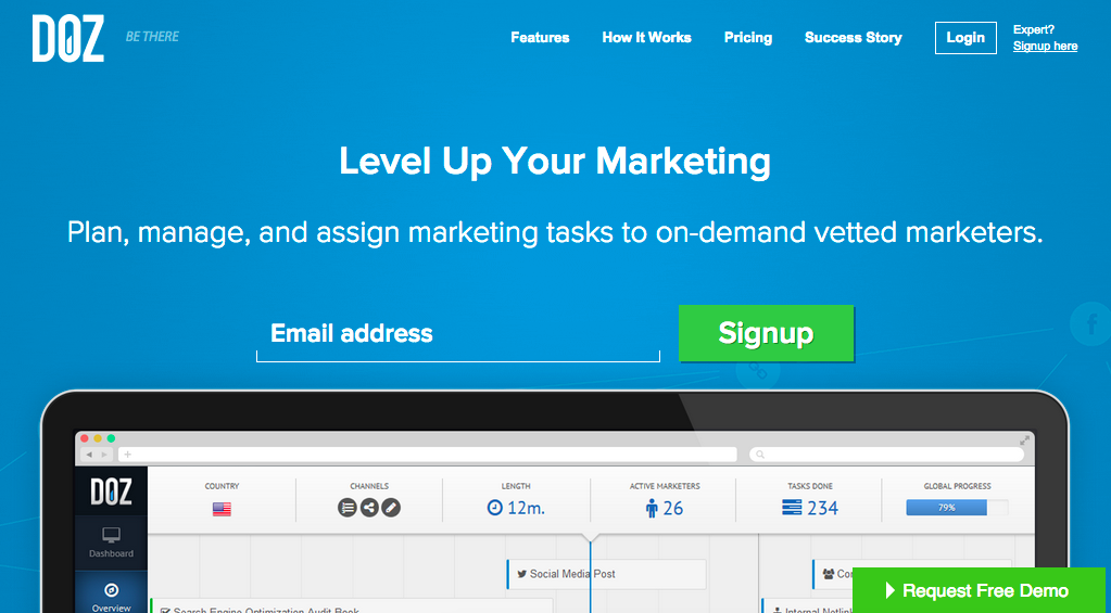
The website you are reading right now at DOZ.com is an example of a site using responsive design. Depending on the device that is used to access the site is presented slightly differently, but always with the same functionality and content. Here, for example, is what the DOZ website looks like when accessed by a desktop or laptop computer:
Here is the same website rendered on a Google Nexus 7 tablet:
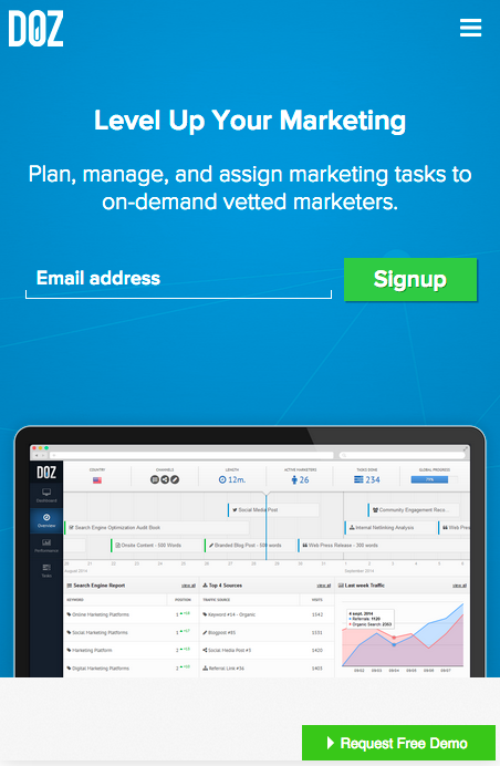
On a smartphone with an even lower resolution and smaller screen size, the site looks slightly different again. First on a Samsung Galaxy S5:

And then on a far smaller Motorola RAZR V8:

The responsive design keeps some things the same but, where the screen space is too limited to allow menus to appear the web design allows a single, clickable (or tappable) menu icon to appear its place. This keeps the site easy to navigate and allows a mobile user access to the same information that a desktop or laptop user has.
Design elements like the ‘request free demo’ bar are maintained and included on the screen no matter what the resolution, and the logo of the company remains visible no matter what device is used to access the page.
Other examples of responsive design have been collected online, with best practices (including screenshots) gathered by:
- Stephanie Irvine – The 14 Best Examples of Responsive Design
- Justin Avery – Responsive Web Design Examples
- Mike Abasov – 70 Stunning Responsive Sites for Your Inspiration
3 Reasons Why Is Responsive Design the Best Option for Mobile Users
As we explained, there are three different options for getting your site mobile – but adopting a responsive design is best. That’s not just us telling you to do as we do at DOZ. It’s the very best solution for at least 3 reasons.
- One URL for your business. In a competitive global market getting visitors to find your site in the first place can be tough enough. There is no need to make it tougher on them finding you, sharing your URL, and accessing your site later from a different device – yet this is exactly what having separate URLs for your primary and mobile sites does. Sure, you’ve visited sites with an ‘m’ in the URL before, but they are not optimized for large screens and sharing them with desktop users only presents the worst possible impression of your business. Keep it simple, keep it native, and keep everything on URL that you can share without fear of disappointing anyone.
- Easier updates. You’ve got a new front page to publish and, with a responsive design, nothing is simpler. Publish or push the front page once and you’re done. Need to update or spotted a typo that somehow snuck through the checking and double-checking? No problem – update the page and it’ll be served for mobile and desktop users alike in its improved, correctly spelled version. For a webmaster the biggest benefit of the responsive design is that things only need to be updated once, posted once, or a change applied in one place for it to be pushed to all versions of the site.
- Ready for evolution. Phones started big, then got small, then got big again, then got HD, then got phabulous, too. The mobile screens that web designers are preparing code for are constantly in flux and there is no telling quite which way the market will turn next. In addition there is no standard screen size, no standard screen resolution, and no standard portrait or landscape layout for mobile browsers. Indeed, modern mobile browsers adapt to the way the user holds the smartphone or tablet – and so should your website. Don’t design a site for the iPhone, another for the iPad, and another for the next generation iDevice that is about to be launched – design one responsive site and be ready for when the market changes.
Conclusion
Getting your site mobile ready is essential to avoid Google penalties and to improve the user experience for visitors to your site. Though there are different options to taking your site mobile, by far the best is responsive web design. not only will you keep a single, shareable URL for your business, it will be easier to update and ready of any evolution in screen size, changes in smartphone or mobile technology, and trends in mobile design.
Made the transition to responsive design? Let us know how it worked out on Twitter!


21 Comments
624663 21466you can have a wonderful weblog here! would you wish to make some invite posts on my weblog? 386630
تخضع تجهيزات مصنع إيليت بايب Elite Pipeلعمليات مراقبة جودة صارمة للتأكد من أنها تلبي متطلبات الأداء والمتانة الأكثر صرامة.
Sutter Health
Very good blog you have here but I was curious if you knew of any message boards
that cover the same topics discussed here?
I’d really like to be a part of group where I can get feedback from other
knowledgeable individuals that share the same interest.
If you have any suggestions, please let me know. Appreciate it!
Really when someone doesn’t know after that its up to other viewers that they will assist, so here it occurs.
Awesome! Its actually awesome article, I have got much clear
idea regarding from this paragraph.
Good day! I just want to offer you a big thumbs up for
the great info you have got right here on this post.
I am coming back to your web site for more soon.
best of jazz
292356 180206An incredibly fascinating read, I may well not concur completely, but you do make some incredibly valid points. 301766
384364 200147Greetings! Quick question thats completely off subject. Do you know how to make your web site mobile friendly? My weblog looks weird when viewing from my iphone. Im trying to uncover a template or plugin that may well be able to fix this difficulty. If you have any recommendations, please share. Appreciate it! 389960
itâ€

It’s nice to see the best quality content from such sites.
I m going to bookmark your web site and maintain checking for brand spanking new information.
I really like reading through a post that can make men and women think. Also thank you for allowing me to comment!
84805 202010Merely wanna input on couple of common issues, The internet site layout is perfect, the articles is truly great : D. 436050
392537 323924We are a group of volunteers and opening a new system in our community. Your web web site given us with valuable details to work on. Youve done an impressive job and our entire community will probably be grateful to you. 170515
315396 301219Howdy! I just want to give an enormous thumbs up for the wonderful information you might have here on this post. I will likely be coming back to your weblog for a lot more soon. 637960
The other day, while I was at work, my sister stole my iphone and tested to see
if it can survive a 40 foot drop, just so she can be a youtube
sensation. My iPad is now broken and she has 83 views.
I know this is totally off topic but I had to share it with someone!
Wow, this piece of writing is good, my sister is analyzing these
kinds of things, therefore I am going to let know her.
I think the admin of this site is really working hard for his web site, because here every information is quality based
stuff.
Joyful, I’ve ascended to this new height with this riveting book, many thanks to the author!